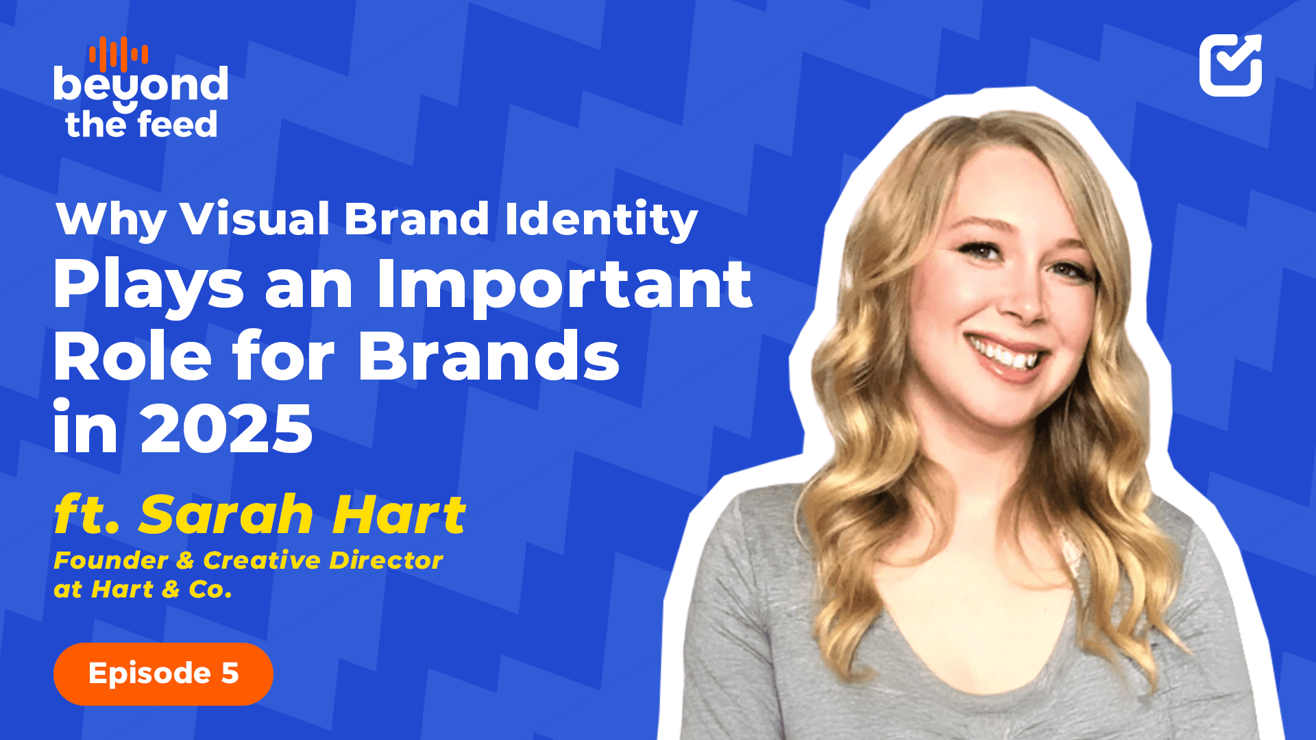
Recently, I sat down with Sarah Hart, the founder of Heart & Go and a visual identity designer for industrial leaders.
What I expected to be a quick conversation about logos and colors turned into a full discussion on psychology, design trends, distinctiveness, and how AI is reshaping branding as we know it.
Check out the full podcast here:
Here’s everything she shared, and trust me, it’s the kind of perspective every brand needs going into 2026.
Why Visual Branding Is No Longer About Looking Polished
One of the first things Sarah told me was that visual branding has completely shifted. A few years ago, B2B brands only needed what she jokingly called the “hotel lobby aesthetic,” which is clean, corporate, and safe.
But that’s not enough anymore. Today, we live on the feed, and the real question is: ‘Does your brand stop the scroll?’
According to Sarah, the new goal isn’t to look professional, it’s to be remembered.
Forgettable Design Is the New Wrong Design
When I asked her about “good vs. bad design,” Sarah didn’t go where I expected. Sure, there are technical mistakes, bad spacing, weak contrast, and messy hierarchy.
But the real problem she sees is the brands that look exactly like everyone else. Using the same templates, colors, and layouts triggers the habituation effect, meaning our brains skim right past it.
Bad design isn’t just unattractive. Bad design is invisible.
Color Matters Less Than Cohesion
We talked about color psychology, those viral charts saying “blue means trust” and “red means power.” She immediately called them out. The meaning of color is culturally subjective and wildly overhyped.
What actually matters is:
- Consistency
- Cohesion
- Recognizability
The brand memory system is built through repetition, not through one perfect color choice.
Logos Aren’t Enough Anymore
According to Sarah Hart, too many brands still think the logo is the centre of the universe. Not anymore. Modern brands win by creating a distinctive visual universe, not a single symbol.
She used Stripe as a perfect example. The brand has:
- Recognizable shapes
- A signature gradient
- A consistent illustration style
The logo isn’t the star, the system is.
Fonts Should Support Positioning, Not Steal the Spotlight
When fonts came up, Sarah made an important point: Not every element needs to be distinctive.
Instead, typography should:
- Support your positioning
- Provide clarity
- Feel aligned with your tone
She brought up Notion, which has clean fonts, a simple palette, but a distinctive illustration character that carries the brand.
Content Format Matters Less Than the Strategy Behind It
We talked about carousels vs reels vs static posts.
Her take?
They all work. But each needs to be designed natively for the platform.
She reminded me that human attention is drawn to:
- Faces
- Arrows
- Contrast
- Motion
- Characters or pointing gestures
Your Brand Should Adapt to Each Platform While Staying Recognizable
A brand shouldn’t look identical everywhere. For instance, Instagram rewards motion, LinkedIn rewards conversation, and websites reward depth.
But the brand identity, which shapes colors, typography, and tone, should feel like the same universe.
Consistency doesn’t mean carbon copies. It means recognizability.
AI Is Changing the Design Process
We couldn’t skip the big topic: AI. Sarah said AI is replacing parts of the design process, but it’s also expanding what designers can do.
She uses it for:
- Fast ideation
- Visual brainstorming
- Exploring multiple directions
- Developing new concepts
- Increasing creative output
Most Brands Become Too Polished and Lose Their Edge
This was one of my favourite insights. Brands often follow this pattern:
- Start messy
- Get polished
- Blend in
Once they look “professional,” they accidentally become generic.
According to Sarah, brands should find the balance between polish and distinctiveness. They should be professional enough to be trusted and distinctive enough to be remembered.
New Brands Only Need One Distinctive Asset to Start
Sarah’s advice for early-stage founders was simple:
- Pick ONE thing to own; It can be a shape, a gradient, an icon style, a pattern
- Keep the rest clean and simple
- Build polish gradually over time
- Strengthen the identity as you grow
Distinctiveness doesn’t require complexity. Instead, it requires intentionality.
Invest in Visual Identity When You’re Ready to Lead
She also stressed that branding should follow strategy. You should invest when:
- The business is growing
- The message is clear
- The audience is defined
- You’re ready to position yourself as a leader
Sarah believes that brand visuals are not decoration; they’re an accelerant.
Avoid Trend Chasing if You Want a Timeless Brand
Some trends belong to the moment, not the brand identity. Puzzle feeds, neon gradients, aesthetic templates… they all fade fast.
Sarah’s advice is to follow trends in how you execute, not in what defines your brand long-term. Timeless visuals beat trendy ones every time.
Closing Thoughts for Designers
Before we wrapped up, she left me with this:
“Pretty design isn’t the goal anymore. Strategic, distinctive design is. Make people remember the brand, not just admire the visuals.”
And honestly, that sums up the entire conversation!
