Did you know that when two products deliver the same function, color alone can tip the scale and make one far more appealing than the other?
According to research, 85% of buyers consider color a key factor when choosing between similar products. That statistic already hints at how powerful brand colors can be when you want people to recognize and remember your brand.
On social media, where users scroll quickly and attention is limited, consistency in brand colors matters even more. Strong brand colors help your content stand out while reinforcing a consistent brand identity that feels familiar at first glance.
Short Summary
- Understanding color psychology helps you select brand colors that evoke the right emotions and align with your brand personality.
- A simple, well-defined palette with primary, secondary, and accent colors ensures consistent social media branding.
- Testing colors for accessibility and platform-specific display maintains readability and strengthens your visual identity.
- Avoid common brand color mistakes such as too many colors, inconsistent shades, and mismatched tones to reinforce trust and recognition.
- Using templates and scheduling tools like Social Champ keeps your visuals cohesive and saves time.
As a result, audiences start associating specific colors with your brand, which strengthens recognition and builds trust over time.
This visual consistency supports engagement, especially since people are more likely to interact with content that feels recognizable and cohesive at a glance.
This guide explains how to choose brand colors that work well together and stay consistent across channels.
It also shows how thoughtful color choices in social media branding support long-term engagement, especially when paired with a reliable social media management tool that keeps your visuals aligned everywhere you post.
Why Brand Colors Matter on Social Media
Brand colors play a huge role in recognition and recall. When people scroll through busy feeds, familiar colors help your posts stand out before they even read a caption. Over time, those colors become a visual shortcut to your brand.
Color also shapes emotion, often without people realizing it. Red can feel energetic, blue often feels calming, and yellow tends to spark optimism. This is why brand color psychology matters on social media, where emotions influence likes, comments, and shares.
Essentially, consistency ties everything together. When your posts use the same color palette, your brand feels reliable and intentional. That sense of visual order builds trust, and trust usually leads to higher social media engagement.
Well-known brands prove this point every day. Take Coca-Cola, for example.

Its red feels unmistakable, even without a logo. That single color instantly signals familiarity long before any text or imagery appears.
Tiffany & Co’s blue works the same magic in a very different way.

The color alone signals elegance and exclusivity before any words appear. It sets expectations instantly and shapes how people feel about the brand.
These examples show how powerful color can be on social media. Familiar visual branding builds trust, and trust makes people more likely to like, comment, and remember the brand long after they scroll past.
Featured Article: Everything You Need to Know About Social Media Branding
Understanding Color Psychology
Color psychology explains how different colors influence emotions, perceptions, and behavior. In branding, these reactions shape how people feel about your content before they even read a word.
Each color sends subtle signals to your audience, which makes color choices an important part of shaping how your brand feels on social media. For instance:
Red: Excitement, Urgency, Passion
Red grabs attention almost instantly. It creates a sense of urgency that often encourages quick decisions. The color also expresses passion, which makes it effective for bold brands that want to feel energetic and confident.
Trust, Calm, Professionalism
Blue feels reassuring and dependable. It creates a calming effect that puts audiences at ease. Many professional brands rely on blue to signal credibility and reliability.
Green: Growth, Health, Balance
Green connects strongly with nature and renewal. It often represents growth and positive progress. The color also suggests balance, which makes it appealing for wellness and sustainability-focused brands.
Yellow: Optimism, Energy, Attention
The color meaning of yellow is cheerful and uplifting. It brings a sense of energy that can brighten up social media visuals. When used thoughtfully, it draws attention without overwhelming the viewer.
Purple: Luxury, Creativity
Purple often feels rich and refined. It carries a creative edge that sets brands apart visually. This color works well for brands that want to feel imaginative or premium.
Orange: Friendly, Playful, Confidence
Orange feels warm and approachable. It creates a playful tone that encourages interaction. The color also signals confidence, which helps brands appear bold without feeling aggressive.
Choosing the right colors depends on your brand values and the audience you want to reach.
This understanding acts as a practical social media color guide when deciding how you want your brand to be perceived.
When you choose brand colors that align with how you want people to feel, your visuals support a consistent brand identity across every social media platform.
Featured Article: How to Build a Brand Identity Across Social Media Channels
Steps to Choose Your Brand Colors
Now that you understand how colors influence emotions and perception, the next step is turning that knowledge into practical choices you can actually use across your social channels.
Here are the steps to choose the best colors for your brand:
Step 1: Define Your Brand Personality
What do you want your brand to convey? Think about whether your brand should feel bold, calm, playful, or refined.
These traits act as a guide when you begin exploring how to pick brand colors that reflect your overall tone and voice.
To give you an example, take a look at the Instagram grid of @potters.gallery on Instagram. The brand has taken a playful-yet-sophisticated approach on its social media. While it uses a plethora of colors in its posts, it balances out the designs by using warm and neutral tones.

Step 2: Know Your Audience
Different audiences respond to colors in different ways. Age, culture, and even industry expectations can influence how colors are perceived.
When you understand who you are speaking to, choosing a color palette for social media becomes more intentional and effective.
Step 3: Research Competitors
Look at what similar brands in your niche are doing with color. This step helps you avoid blending in while still staying relevant to your market.
The goal is to find a balance between standing out and fitting naturally within your industry.
Step 4: Pick Primary, Secondary, and Accent Colors
A strong color system includes more than one shade. Your primary color carries your main brand identity, while secondary and accent colors add flexibility.
This structure supports brand identity design and makes it easier to adapt visuals for different social media formats.
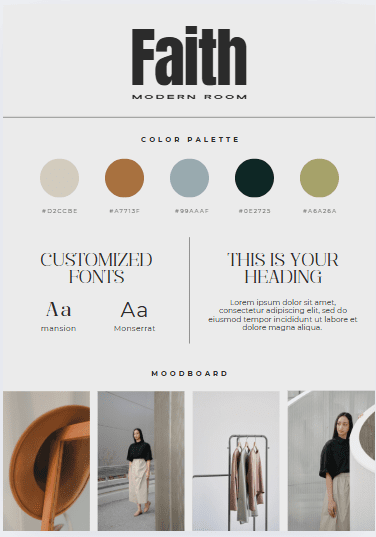
Here’s what your brand kit should look like:

Step 5: Test and Refine
Once your colors are in place, try them across posts, stories, and ads. Pay attention to engagement and overall visual harmony.
Small adjustments can make a big difference in how your brand is perceived.
Choosing brand colors is not about perfection from day one. It is about creating a flexible, recognizable system that grows with your brand and keeps your social media presence visually consistent.
How Many Colors Should You Include in Your Brand Kit?
When building a brand color palette, one of the biggest challenges is knowing how many colors are enough, without using too many.
To keep things simple, your brand kit should include a small, intentional set of colors, each with a specific role.
A strong brand color palette usually includes:
- 1–2 Primary colors
These are your brand’s main colors and should appear most frequently across your website, social media, and marketing materials. - 1–2 Secondary colors
These support your primary colors and add flexibility without overpowering your visuals. - 1–2 Accent colors
Used sparingly for highlights, buttons, links, or calls to action.
In total, aim for 3–6 colors in your brand kit.
Should Primary Colors Have Multiple Shades?
Yes, but with intention. Your primary brand colors can include a few approved shades or tints to create depth and flexibility.
For example, a lighter shade for backgrounds and a darker one for text or emphasis. The key is to define these shades upfront rather than improvising them later.
Having pre-approved shades:
- Maintains visual consistency
- Prevents random color variations
- Makes content creation faster and easier
However, choosing colors isn’t enough, you also need to lock them in.
Your brand kit should clearly list:
- HEX codes (for web and social media)
- RGB values (for digital use)
- CMYK values (for print, if applicable)
This ensures your colors look the same across all platforms and prevents small shade differences that can weaken brand recognition.
Essentially, using too many colors, or inconsistent shades of the same color, can confuse your audience and dilute your message.
Whereas, a limited, well-documented palette makes your brand visuals cohesive, memorable, and easy to recognize at a glance.
A simple rule to follow: If your brand looks the same everywhere it shows up, your color palette is doing its job.
Tools to Create Your Brand Color Palette
Once you know how to pick brand colors, the next step involves turning those ideas into a usable palette that stays consistent across your content.
Thankfully, several brand color palette tools make this process far less intimidating and much more enjoyable. Here are two popular choices:
Canva

Canva works well for beginners and experienced creators alike. It helps you generate color palettes, apply them to templates, and preview how they look on real social media posts.
This makes it easier to maintain color consistency while designing visuals quickly.
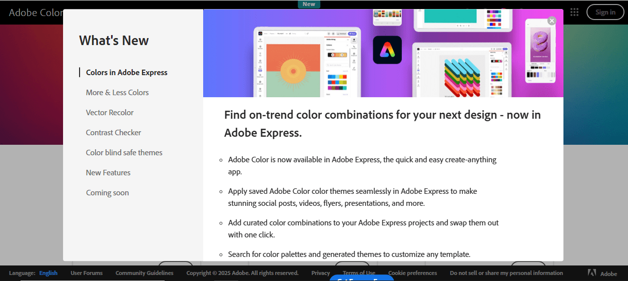
Adobe Color

Another good choice is Adobe Color, which focuses more on precision and theory. It allows you to explore color harmonies, build palettes from scratch, or extract colors from images.
The tool suits brands that want deeper control over their color relationships and overall visual balance.
After choosing your colors, readability still matters just as much as aesthetics. You can use color accessibility tools to check contrast ratios and ensure your visuals remain clear for all users, including those with color vision differences.
These tools support color consistency while making sure your posts feel welcoming and easy to engage with.
Together, these social media branding tools help transform your chosen colors into a reliable system that looks great and works well across every platform you use.
Applying Brand Colors Consistently Across Social Media
Applying your brand colors consistently across social media ensures that every post reinforces your brand identity design.
When your colors appear uniformly, your audience begins to recognize your content instantly, which builds trust and engagement.
To make this process easier, focus on a few key practices:
Consistent Use in Posts, Graphics, Stories, and Ads
Keeping your colors uniform across all types of content ensures that your brand feels cohesive no matter where your audience encounters it.
For example, your Instagram story, Facebook ad, and LinkedIn post should all reflect the same primary and accent colors.
This repetition helps viewers instantly recognize your brand, even before seeing your logo or reading your caption.
Over time, this consistency strengthens brand recognition and makes your social media presence look polished and professional.
It also reduces confusion, so your audience associates the emotions and values tied to your color palette directly with your brand.
Use Templates to Keep Your Brand Colors Consistent
Templates work for posts, stories, ads, and even carousel content, ensuring every piece of content feels like it belongs to the same brand family.
Creating templates for your social media posts saves time and keeps your visuals looking cohesive.
When you design templates that already incorporate your primary, secondary, and accent colors, you don’t have to worry about using the wrong shade or losing visual harmony.
Templates also make scaling your social media easier. Whether you’re posting daily or running multiple campaigns at once, having ready-to-use layouts speeds up the process without compromising color consistency.
This approach allows you to focus more on crafting engaging content while maintaining a strong, recognizable brand identity across all platforms.
Streamline Your Posting With Social Champ

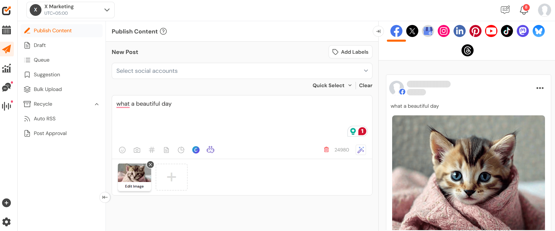
Using Social Champ makes it simple to schedule and reuse branded content across all platforms while keeping your colors consistent.
Instead of manually posting every update, you can plan your content in advance so each post reflects your brand color palette and visual identity. This saves time, reduces errors, and ensures your audience sees a cohesive brand presence no matter where they interact with you.
With Social Champ, you can efficiently schedule social media posts while reinforcing a strong, recognizable brand identity at every touchpoint.

Social Champ helps you publish content to 11 platforms from a single dashboard. Try it now and build your brand!
Common Mistakes to Avoid
Choosing brand colors can be tricky, and small missteps can weaken your visual identity on social media.
Here are some frequent brand color mistakes to watch out for:
-
Using Too Many Colors or Inconsistent Shades
Overloading your palette can confuse your audience and dilute your brand message. Using inconsistent shades of the same color across posts also breaks social media branding consistency.
To strengthen recognition, it’s best to keep it simple. This means sticking to a few primary, secondary, and accent colors. This will make your visuals cohesive and memorable.
-
Ignoring Accessibility
Another common mistake is neglecting accessibility, particularly when it comes to contrast. Colors that look great on your own screen might be hard to distinguish for users with visual impairments, such as color blindness or low vision.
Additionally, low contrast between text and background not only makes content difficult to read but also reduces engagement and can frustrate your audience.
Therefore, testing your palette for readability is essential. You can use color palette generators to ensure your text stands out clearly against backgrounds.
You can also view your designs in black-and-white to spot areas where contrast may be too low.
Prioritizing accessibility strengthens your social media branding consistency and ensures your audience can engage with your content comfortably, no matter their visual abilities.
-
Not Adapting Colors for Different Platforms
Different social media platforms often render colors in slightly different ways, which can affect how your brand visuals appear.
For example, a bright red that grabs attention on Instagram might look muted or washed out on LinkedIn or X.
Without adjusting your palette, your content can appear inconsistent and confuse your audience.
To avoid this, test your color palette on each platform before posting. Slightly tweak shades to ensure they look vibrant and maintain readability everywhere.
You can also use platform-specific templates, and preview tools can help maintain uniformity while keeping your brand identity intact.
Adapting your colors this way ensures your visuals remain strong and recognizable across every channel, reinforcing your brand color palette and overall visual identity design.
-
Failing to Align Colors With Brand Personality
Choosing colors that don’t reflect your brand’s personality can send the wrong message and confuse your audience.
For instance, a luxury brand that relies on bright, playful colors may appear less sophisticated, while a health-focused brand using overly dark or harsh tones could feel uninviting.
When your colors clash with your brand values, it creates a disconnect between your visual identity and the message you want to convey.
You can avoid this by defining your brand personality clearly from the word go. Decide whether your brand is playful, professional, luxurious, eco-friendly, or energetic, and then choose colors that naturally express those qualities.
Consistently using these colors across posts, stories, ads, and other content reinforces your identity and builds trust with your audience.
Conclusion
Understanding how to choose brand colors thoughtfully helps create a brand color strategy that connects with your audience and strengthens your visual identity.
Consistent use of these colors across posts, stories, ads, and graphics ensures consistent social media branding that people recognize and trust.
Using a tool like Social Champ makes this process easier. It allows you to schedule posts, reuse branded content, and maintain your color consistency across all platforms.
With Social Champ, your visuals stay cohesive, and your brand identity shines through every piece of content.

Plan, schedule, and share your content across all platforms while maintaining a strong and recognizable visual identity with ease.


