Like everyone else scrolling through LinkedIn, you may have noticed some posts that grab attention, while yours just get lost in the feed.
And you think, why is your content not getting the same clicks or comments even when you’re putting a lot of effort into it, right?
Let me tell you the answer to this question: the LinkedIn post size.
Yes! When you post the wrong size, it can make your images blurry, videos cut off, or your text look cramped, which causes you missed opportunity to connect with clients, partners, or your audience.
Short Summary
- Correct LinkedIn post size ensures visuals look clean and professional.
- Images, videos, carousels, documents, and articles each have specific dimensions.
- Proper sizing improves engagement, readability, and audience attention.
- Scheduling posts with Social Champ keeps content consistent and on-brand.
- Paying attention to size helps your LinkedIn posts stand out and get noticed.
So, if you want to make your every post shine, grab attention, and get the results, you need to know how to post on LinkedIn correctly.
Stick around. I’ll guide you through every format and size so your content performs like a pro.

Be Seen Before It’s Too Late!
Don’t let another LinkedIn post go unnoticed. Optimize and post with Social Champ today.
Featured Article: Instagram Ad Sizes: A Comprehensive Guide for Eye-Catching Creatives
Why LinkedIn Post Size Matters
Once, I published a post on LinkedIn that I felt confident about because the copy made sense, and the design looked clean on my laptop.
But when I opened LinkedIn on my phone, the image was cropped, and the main message felt squeezed.
And that was the reality check for me about LinkedIn post size, and I understood that what looks fine in one place doesn’t mean it will appear the same on another.
LinkedIn adjusts content automatically when sizes don’t match its layout. That adjustment often hurts clarity.
As a result, people scroll past your post without noticing the value you tried to share.
How Post Size Impacts Visibility and Engagement
LinkedIn algorithm favors the content that is easy to consume. If your visuals look clean, people will definitely stop the scroll.
And that only happens when you follow the right LinkedIn post dimensions. Your post takes up the right amount of space in the feed.
This is also important when you share LinkedIn videos. If their size is off, your important details disappear.
Why Size Shapes Brand Perception
If I talk about myself, I find visuals more appealing compared to only text.
And when your visuals are of consistent size, it makes your brand feel reliable. That’s why it’s important to use the correct LinkedIn photo dimensions across posts to build familiarity.
This way, people will begin to recognize your content without reading your name.
The same applies to profile visuals. A poorly sized banner looks unpolished. The correct LinkedIn banner size helps your profile feel complete and credible at first glance.
Quick Reference: LinkedIn Post Size Overview
Before we go deeper, here is a simple snapshot of how different formats behave on LinkedIn. This sets the foundation for the formats we will cover next.
| Post Format | Recommended Size | Aspect Ratio | Key Notes |
|---|---|---|---|
| Image Post | 1200 × 1200 px | 1:1 | Reliable choice for most feeds |
| Landscape | 1200 × 627 px | 1.91:1 | Common for link previews |
| Video Post | 1080 × 1080 px | 1:1 | Works well on mobile |
| Carousel | 1080 × 1080 px | 1:1 | Keep all slides consistent |
| Banner Image | 1584 × 396 px | 4:1 | Matches LinkedIn banner size rules |
Considering this, size stops being a design detail and becomes part of your content strategy. When you follow LinkedIn post specs, your posts have a fair chance to perform without extra effort.
Featured Article: LinkedIn Isn’t Boring Anymore: 7 LinkedIn Post Types That Are Crushing It
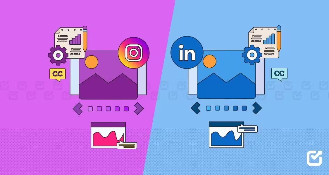
Recommended LinkedIn Post Sizes for Images, Videos, and Carousels

When you use LinkedIn, you see that everypost doesn’t look the same. That’s exactly why LinkedIn post size matters more than you think.
Images, videos, and carousels each behave differently in the feed, and you can’t treat them the same.
Because it can result in text getting clipped and visual focus being lost.
If you understand LinkedIn post size by format properly, it helps your content look intentional instead of rushed.
Image Posts: Where Most Brands Get It Wrong
Many brands think image posts are simple. I used to believe that you just have to upload a graphic, add a caption, and that’s it.
Then I noticed something odd. The same image looked sharp on one post and awkward on another. That’s when I started paying attention to LinkedIn post image size.
For square images, 1200 × 1200 pixels works best. It fits cleanly on desktop and mobile. And landscape images do better at 1200 × 627 pixels, especially for links.
If you follow proper LinkedIn image post size guidelines, it prevents unexpected cropping.
Because image quality also matters. Blurry visuals reduce trust fast. Clear images make your message easier to absorb and more likely to earn clicks.
Video Posts: Size Decides If People Watch or Skip
Video posts have changed how people use LinkedIn, but only when it fits the screen.
Once, I shared a wide video that looked fine elsewhere. But on LinkedIn, its key element disappeared.
Square videos at 1080 × 1080 pixels take up more feed space. Vertical videos work too, but only when they follow accepted social media video sizes. Anything outside these ranges risks compression.
If you run LinkedIn ads, this becomes even more important. Poor sizing can drain the budget without results.
Carousel Posts: Consistency Is Everything
Carousels reward structure. Each slide should use the same LinkedIn post size and layout. The safest option is 1080 × 1080 pixels.
I learned this after mixing layouts. Engagement dropped halfway through. Consistent LinkedIn dimensions keep your story flowing.
You should avoid placing text near edges. LinkedIn spacing can hide important details. These formats align closely with how LinkedIn features display content across devices.
Quick Tip!
Always check your LinkedIn image size for posts before uploading. Even a small cropping mistake can reduce engagement drastically.
Recommended LinkedIn Post Sizes for Documents, Polls, and Articles

It’s not necessary that you include a bold image or a video in every LinkedIn post. Sometimes, the goal is to explain, educate, or start a conversation.
That’s where documents, polls, and articles come in.
Even here, LinkedIn post size plays a quiet but important role. When these formats are sized correctly, they feel easy to read and simple to engage with.
Document Posts: Clear Slides Get More Saves
If you want to share step-by-step guides, reports, and short presentations, document posts work well.
I use document posts when I want my audience to slow down and spend more time with my content.
But you know what? When I gave it a first attempt, it didn’t go well. Text looked cramped. Slides felt messy. That was a sizing issue.
The recommended LinkedIn dimensions for documents are 1080 × 1080 pixels. Square pages fit naturally in the feed and feel familiar to users.
You can upload PDFs or PPT files, but each slide should follow the same layout. Keep margins wide. Avoid tiny fonts.
Clean formatting makes your content easier to save and share. This matters even more for B2B audiences who skim first and read later.
Polls: Size Is Simple, Structure Is Not
When you share polls on LinkedIn, they don’t rely on images, but they still depend on structure.
LinkedIn limits poll options and text length. If your question is too long, it gets cut. That reduces participation.
Short questions work best, so you should focus on one idea per poll. This aligns closely with LinkedIn’s best practices, where clarity often wins over creativity.
Polls also perform better when they feel easy to answer in a few seconds. While polls don’tt require a specific image size, pairing them with a clean caption helps them stand out in the feed.
Articles: Cover Images Shape First Impressions
If you want to share long-form thought leadership, LinkedIn articles matter.
When you share any LinkedIn article, its cover image is the first thing people see, and size mistakes show fast.
The recommended LinkedIn article image size is 1200 × 627 pixels. This keeps the image sharp across devices.
You should avoid placing text near edges, as LinkedIn crops previews differently on mobile.
I noticed higher click rates once I treated article covers like mini landing pages. Clean visuals invite readers in. Poor sizing pushes them away.
Articles also work well for community-focused pages, including LinkedIn for nonprofits, where storytelling and clarity matter more than flashy visuals.
Every Post Should Look Like It Matters!
Sloppy images and videos hurt engagement. Social Champ ensures your LinkedIn content always looks intentional and professional.
LinkedIn Banner and Profile Image Dimensions
It’s common that people view your LinkedIn profile before your posts. That means your visuals set expectations right away.
If your banner looks stretched or your profile photo appears blurry, it affects how people perceive your brand.
This is where LinkedIn banner size and profile image dimensions matter more than most people realize.
Profile Image: Small Space, Big Impact
When people scroll through their LinkedIn feed, your profile photo appears small. Because of that, clarity matters more than design flair.
The recommended LinkedIn size for a profile image is 400 × 400 pixels. It displays as a circle, so anything near the edges gets cut.
I learned early to keep faces centered and backgrounds simple. Logos also work, but only if they stay readable at a smaller scale.
If you use the right LinkedIn image size for posts, it doesn’t help here. For profile images, you have to follow other rules.
A clean profile photo builds trust. It tells viewers you pay attention to details.
Banner Image: Your Silent Pitch
And if we talk about your profile banner, it sits quietly at the top of your profile. Still, it carries weight.
The recommended LinkedIn banner size is 1584 × 396 pixels. This wide format gives you room to communicate value, but only if you respect safe zones.
Text placed too far left or right often gets cut on smaller screens. I once added a call to action that disappeared on mobile. Since then, I keep key text centered and minimal.
Here, consistent branding matters. You should use the same colors, fonts, and tone to create a smoother experience.
Over time, this visual consistency strengthens recognition.
Why Consistency Across Profile and Posts Matters
Your posts might follow the correct LinkedIn post size, but if your profile visuals feel off, the experience breaks. People notice when banners, profile images, and posts feel disconnected.
You should keep your LinkedIn header image size aligned with your post visuals. It helps everything feel intentional.
This matters for founders, recruiters, agencies, and teams building credibility over time.
Quick Size Reference
| Visual | Recommended Size | Notes |
|---|---|---|
| Profile Image | 400 × 400 px | Center subject |
| Banner Image | 1584 × 396 px | Keep text centered |
P.S. Even your profile and banner images matter. Using the correct LinkedIn banner size ensures your profile looks professional across all devices.
Featured Article: The Best Time to Post on LinkedIn: Maximize Engagement With Strategic Timing
Scheduling LinkedIn Posts With Social Champ
Now you’ve learned the right LinkedIn post size, but you may face a new problem.
If you post manually, it often results in cropped images, poorly framed videos, or misaligned carousels.
Even when I followed the specs, mistakes slipped through. But what makes it easier than ever is scheduling!
When you schedule your LinkedIn posts, it gives you a chance to review visuals and captions before anything goes live.
This way, you can reduce errors and improve consistency.
Consistency Across Formats
You know very well that different content types have different dimensions. Images, videos, carousels, and documents all require separate sizing.
When you schedule your posts, you can easily apply the right LinkedIn post image size for each format.
How Social Champ Helps

For this, you can use Social Champ to simplify your process.
With this tool, you don’t have to struggle with multiple uploads. Instead, you can plan and schedule all formats in one place.
Your every post will follow the proper LinkedIn post specs, and your branding will stay consistent across the feed.
The Impact on Engagement
When I started planning ahead, it transformed the way my posts performed. Correct sizing combined with consistent scheduling made visuals sharper and more readable.
Engagement improved naturally because posts looked intentional and polished. Small changes in planning created noticeable results in reach and interaction.
One Mistake Can Cost Engagement!
A tiny mis-sized image can reduce clicks and reach. Social Champ ensures your visuals hit the feed just right.
Featured Article: Choose the Right Facebook Cover Photo Size
Conclusion
LinkedIn post size might seem like a tiny detail, but trust me, if you choose the right size, it makes a big difference.
I’ve posted images and videos that looked great on my screen, only to see them cropped or awkward in the feed.
If your visuals are perfect, your posts look cleaner, and they grab your audience’s attention immediately.
Tools like Social Champ can help you schedule everything without worrying about sizes or mistakes.
In the end, a little attention to size goes a long way in making your content stand out and keeping your audience engaged.