A media kit is a promotional package that includes comprehensive information about a celebrity, their brand partnerships, and social media presence.
Celebrities provide these kits to brands to facilitate understanding of potential paid collaborations. The kit is crafted to highlight the influencer’s strengths, achievements, and what they can bring to a partnership with the brand.
Media kits are tools used by influencers and celebrities to present themselves to brands, PR agencies, businesses, and other potential partners.
All established influencers and celebrities typically have media kits, which they distribute to businesses interested in collaborations. These kits help streamline the introduction and highlight key aspects of their profile and capabilities.
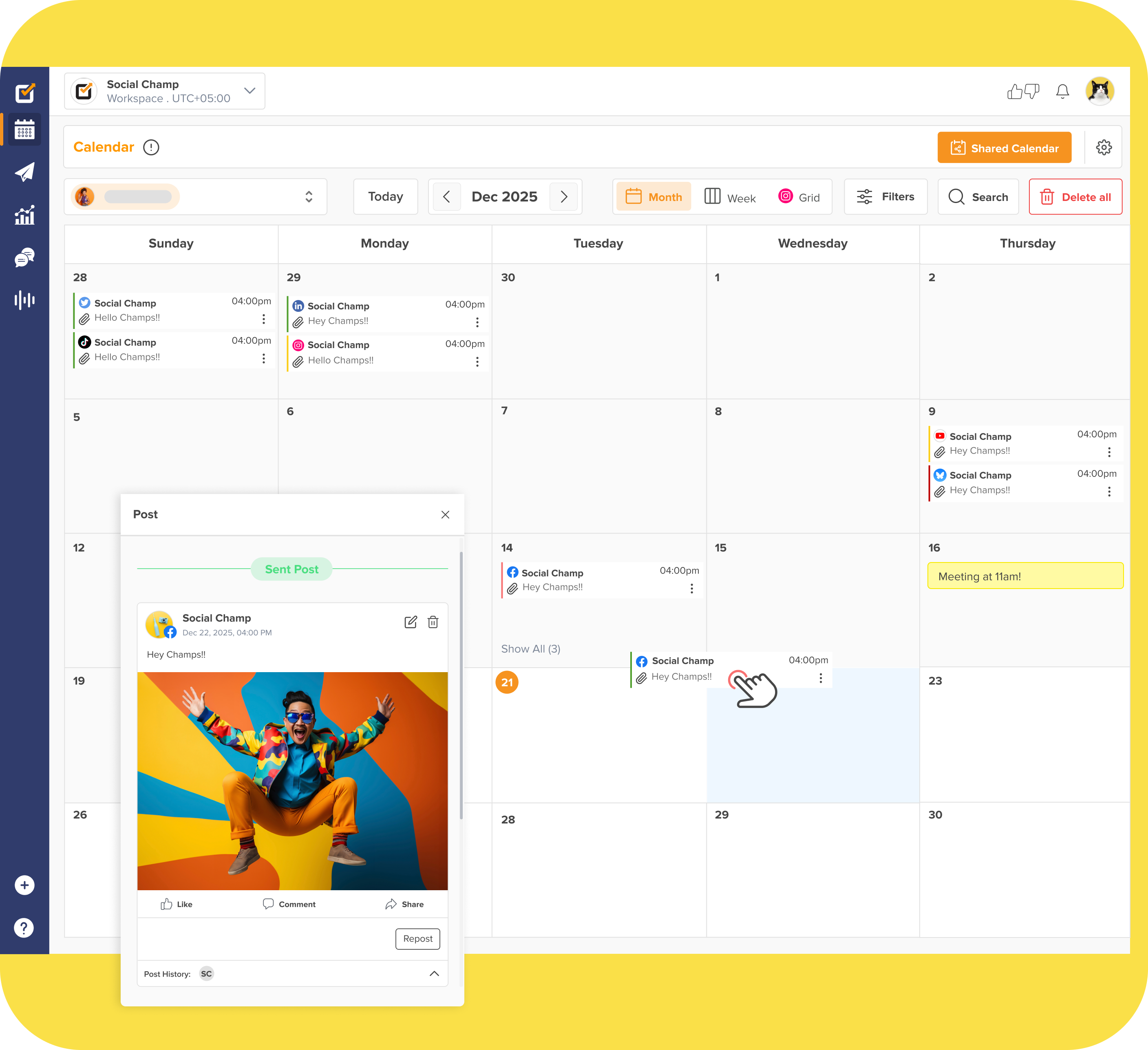
These kits often incorporate visual elements to enhance their appeal alongside detailed textual information. You can create your own templates using platforms like Canva. If you’re looking for a free and easier option, Social Champ’s media kit templates are an excellent choice.
Simplify Your Social Media Strategy.
With Social Champ, effortlessly apply the best practices you’ve just learned. Schedule posts, analyze performance, and engage with your audience—all in one place.
Start Free Trial
<script>
document.addEventListener('DOMContentLoaded', function() {
    function transformTablesForMobile() {
        if (window.innerWidth > 767) return; // Only for mobile

        const tables = document.querySelectorAll('#brxe-qvtevz table');

        tables.forEach(table => {
            if (table.classList.contains('transformed')) return;

            let headers = [];
            const thead = table.querySelector('thead');
            const tbody = table.querySelector('tbody');

            // Get headers - check for both th and td in thead
            if (thead) {
                const headerRow = thead.querySelector('tr');
                if (headerRow) {
                    // First try th, then td
                    let headerCells = headerRow.querySelectorAll('th');
                    if (headerCells.length === 0) {
                        headerCells = headerRow.querySelectorAll('td');
                    }
                    headers = Array.from(headerCells).map(cell => cell.textContent.trim());
                }
            } else if (tbody) {
                // If no thead, take first row
                const firstRow = tbody.querySelector('tr');
                if (firstRow) {
                    let headerCells = firstRow.querySelectorAll('th');
                    if (headerCells.length === 0) {
                        headerCells = firstRow.querySelectorAll('td');
                    }
                    headers = Array.from(headerCells).map(cell => cell.textContent.trim());
                }
            }

            // Return if no headers found
            if (headers.length === 0) return;

            // Get all data rows
            const rows = Array.from(tbody.querySelectorAll('tr'));
            const dataRows = rows; // All tbody rows are data rows when thead exists

            // Create new structure
            const newContainer = document.createElement('div');
            newContainer.className = 'mobile-table-container';

            // Create a section for each column
            headers.forEach((header, colIndex) => {
                const columnSection = document.createElement('div');
                columnSection.className = 'mobile-column-section';

                const columnHeader = document.createElement('div');
                columnHeader.className = 'mobile-column-header';
                columnHeader.innerHTML = header; // Use innerHTML to preserve formatting
                columnSection.appendChild(columnHeader);

                const columnList = document.createElement('div');
                columnList.className = 'mobile-column-list';

                dataRows.forEach(row => {
                    const cells = row.querySelectorAll('td');
                    if (cells[colIndex]) {
                        const item = document.createElement('div');
                        item.className = 'mobile-column-item';
                        item.innerHTML = cells[colIndex].innerHTML;
                        columnList.appendChild(item);
                    }
                });

                columnSection.appendChild(columnList);
                newContainer.appendChild(columnSection);
            });

            table.style.display = 'none';
            table.classList.add('transformed');
            table.parentNode.insertBefore(newContainer, table.nextSibling);
        });
    }

    transformTablesForMobile();

    // Handle window resize
    let resizeTimer;
    window.addEventListener('resize', function() {
        clearTimeout(resizeTimer);
        resizeTimer = setTimeout(function() {
            const containers = document.querySelectorAll('.mobile-table-container');
            const tables = document.querySelectorAll('#brxe-qvtevz table.transformed');

            if (window.innerWidth > 767) {
                containers.forEach(c => c.style.display = 'none');
                tables.forEach(t => t.style.display = 'table');
            } else {
                containers.forEach(c => c.style.display = 'block');
                tables.forEach(t => t.style.display = 'none');
            }
        }, 250);
    });
});
</script>
/* Sticky header for tables WITH thead */
#brxe-qvtevz table thead {
background-color: #f0ebf8;
position: sticky;
top: 0;
z-index: 2;
}
#brxe-qvtevz table thead th {
background-color: #f0ebf8;
position: sticky;
top: 0;
}
/* Sticky header for tables WITHOUT thead (first row only) */
#brxe-qvtevz table:not(:has(thead)) tbody tr:first-child {
background-color: #f0ebf8;
position: sticky;
top: 0;
z-index: 2;
}
#brxe-qvtevz table:not(:has(thead)) tbody tr:first-child td,
#brxe-qvtevz table:not(:has(thead)) tbody tr:first-child th {
background-color: #f0ebf8;
position: sticky;
top: 0;
}
/* Mobile Column Layout */
@media (max-width: 767px) {
#brxe-qvtevz table{
max-height:2000px;
}
.mobile-table-container {
display: block;
margin: 20px 0;
border-radius: 12px;
overflow: hidden;
}
.mobile-column-section {
border: 1px solid #E0E0E0;
overflow: hidden;
background: white;
}
.mobile-column-header {
background-color: #E3DFF5;
padding: 15px;
font-weight: bold;
font-size: 16px;
color: #333;
}
.mobile-column-list {
padding: 0;
}
.mobile-column-item {
padding: 15px;
border-bottom: 1px solid #F0F0F0;
background: white;
font-size: 16px;
line-height: 1.6;
}
.mobile-column-item:last-child {
border-bottom: none;
}
.mobile-column-item:nth-child(odd) {
background-color: #F7F6FC;
}
.mobile-column-item:nth-child(even) {
background-color: #FAFAFA;
}
.mobile-column-item strong {
color: #333;
font-weight: 600;
}
}